I've posted a load of step by step designs of my pages so far and I've not done the designs for my 2nd and 3rd pages however I had a much clearer picture in my head when I approached these pages so it didn't develop that much from my initial sketches as I created them. I'm just going to point out a few key features and show the designs.
Page 2
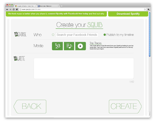
This is the section where you create your squib. I tried to keep it clean and clear by splitting it into clear steps. For the icons I adapted ones currently used within Spotify in order to tie the design in with the brand. the content box and buttons have the rounded corners which Spotify uses on there websites. The squib entry box also has the familiar corner extension design to show that you can increase the size of the box. there is a character count down as well to show how many characters you have remaining.
Page 3

I've just got a placeholder image in for the youtube video at the moment. The enjoy text will only appear once the user has clicked share. This is to enable the site to have a call to action after engaging with its main function. I chose to link back to the friend activity section I had seen on the Spotify Facebook page as that is a nice place to see how your friends are also engaging with the app.
- Leave your comment • Category: Project 4: D and AD
- Share on Twitter, Facebook, Delicious, Digg, Reddit