Just a quick post to show the wireframes which I've drawn up from my sketch book. I will print these off then annotate them properly in my sketch book.
In order they are, Title Screen, Setting menu, Chapter/page menu, and a major scene. I will also have a minor scene but as I will have several variations of them I will just show it drawn in my sketchbook (the story screens in the previous story boards where all minor scenes).


- Leave your comment • Category: Project 2: IPad Design
- Share on Twitter, Facebook, Delicious, Digg, Reddit
I've been working on my story boards and this is how far I though I current am with them (in presentation format).
note this is just the artwork and text I have not placed any of my ui on them yet.
Currently I think that the 4th silde is lacking quite a lot so I will rebuild that one.
- Leave your comment • Category: Project 2: IPad Design
- Share on Twitter, Facebook, Delicious, Digg, Reddit
I've spent the morning sketching and trying out a few different styles to develop.


I'm going to story board for a style very much like the final image. It feels a little lacking in detail but because the elements are so basic I will be able to build up from this as a base.
- Leave your comment • Category: Project 2: IPad Design
- Share on Twitter, Facebook, Delicious, Digg, Reddit
One of the main features of my app is the visuals. I want to give me app a visual usp and I think that the Jekyll/Hyde character has inspired me to use either 2 styles to represent each. this would work by having the whole look change depending on which character the section of the story involved. Another way this could be done is by using inverting the colours e.g. black on white for jekyll and white on black for hyde.
I have already posted links to 2 videos which has inspired these where Una pieza más - Marian Ruzzi y Sr. Amable and The Thomas Beale Cipher. Below are other things which have been inspiring my thoughts on the visual style.
the lines in this piece are fantastic they have a really fragile feel. I also really like the 3D room scenes mixed with animation of just characters this is similar to what I am going to try and do with my major and minor scenes (I've not yet explained this on my blog but I will). Black and white with a spot colour works really nicely as well the spot colour really brings things out of the frame
The really simplified constructionist characters which are in this piece have a really powerful look. the weather look of the style is something that I am keep to transfer over to my final piece.
this animation makes great use of black and white. There are some really good scenes where things are drawn to explain a journy and not just show a single scene. I also really like how the animation transitions between locations playing with scale and angle I think this is something which would work really nicely on the I pad and enhance the simple act of turning a page.
I really like the potential there is to use collage in this project and think that some of the techniques used here could be transferd to my story to give scenes another level of depth by carefully selecting what images/videos to display with the collage. this technique is also used in the Thomas beale cipher.
I really like the finish and character design in Eran Hilleli's work. the simple look is something which I might be able to used to allow me to create strong characters which would be esaily animated and would compress well to save disk space on the ipad. It would lose some of its strength but it could be changed to 2D characters and positioned in a pseudo 3D environment.
- Leave your comment • Category: Project 2: IPad Design
- Share on Twitter, Facebook, Delicious, Digg, Reddit
As I stated in this post an application definition statement will allow me to stay focused on the core of what it is I am going to produce and not be distracted by other ideas. Here is the statement I've written.
Jekyll & Hyde is a visually stunning and immersive retelling of The Strange case of Dr Jekyll and Mr Hyde by Robert Louis Stevenson. Aimed at adults who appreciate creative films and animation.
you'll notice that I have called the app 'Jekyll & Hyde' this is a working title based on the 14 character limit of titles to not be shrunk under the applications icons.
- Leave your comment • Category: Project 2: IPad Design
- Share on Twitter, Facebook, Delicious, Digg, Reddit
Here is an interesting video where designers talk about why they believe games are special.
I have been reading around this subject and I'll write up at a later date on my blog some of the academic thinking around video game narrative.
- Leave your comment • Category: Project 2: IPad Design
- Share on Twitter, Facebook, Delicious, Digg, Reddit
I just watched this video and it has inspired me of another potential visual style I could use. It has also allowed me to think of more ways which I could adapt literature into interactive narrative. This would be by showing key scenes with a large amount of motioning in them but still have it as a stationary image (as if you where seeing something in freeze frame). The image can then transition turn into a basic illustration with minor animation while more of the story is narrated.
- Leave your comment • Category: Project 2: IPad Design
- Share on Twitter, Facebook, Delicious, Digg, Reddit
I'm currently testing out story ideas for Jekyll & Hyde but am getting a bit stuck on ways to implement them. One of the thoughts I had was that I can adapt the novel into a combination of comic and animation. Earlier in the project Kerry Turner from Little Loud came in to talk to us about designing and developing for IPad, she talked us through some of the recent project which she has worked on and one of them is an enhanced comic for channel 4 called The Thrill Electric.
I'm going to play through this comic and see if there is anything I can pick up to help me convert Jekyll & Hyde into a usable story.

This has an interesting story line which as I played through the game I became more and more interested in the characters. I think the media of comic really requires a prolonged exposure to the characters in order for you to develop an emotional relationship to them this could be an issue with my app if I choose not to have an over arching narrative which connects all the different parts.
key features are that they pull the comic out into a 3D environment to make it a little more visually interesting. Extra information and interactions are shown to be present by the sound of a tram bell being pulled, you can then click on a box to find out more information.
- Leave your comment • Category: Project 2: IPad Design
- Share on Twitter, Facebook, Delicious, Digg, Reddit
After deciding not to go with horror as a genera I wrote down several potential directions and events that could happen which I released could be applied to one of my earlier idea of designing a story based around the character Dr Jekyll and his alter ego Mr Hyde.

I think this would be a really interesting character to develop and has the potential to work with a non linear narrative. There are many different stylistic ideas I can think of to represent this characters but I need to get the story in place first.
- Leave your comment • Category: Project 2: IPad Design
- Share on Twitter, Facebook, Delicious, Digg, Reddit
Resist the temptation to add features that are not directly related to the main task. Instead, explore ways to allow people to see more and interact more.
This is another warning against function creep. The second line in this presents an interesting way of looking at adding more immersive features to an interactive story.
Closely associate visual transitions with the content that’s changing. Instead of swapping in a whole new screen when some embedded information changes, try to update only the areas of the UI that need it. As a general rule, transition individual views and objects, not the screen. In most cases, flipping the entire screen is not recommended.
This is something I should consider while wire framing, there will be a load of different ways I can present each of the elements which need to be on screen and considering the consistency between them will bring more of a linear unity to the story.
you also want to prevent people from feeling that they must visit many different screens to find what they want.
This line is from a section which is talking about not over doing the amount of information on each screen. It highlights an issue which could be encounter when designing a story with none linear narratives or functionality.
Like how I need to be aware of the user always being able to stop at any times I need to consider that they may not want to use the app with there sound on or they might want to turn certain elements of it down. This potential loses a very important part of the tools I have available to tell my story. There are solutions to this but I need to think very carefully about them before I make any decisions.
As I stated before there are other lessons which I can learn from this document once I am further along with my design, so I will revisit it later in the project.
- Leave your comment • Category: Project 2: IPad Design
- Share on Twitter, Facebook, Delicious, Digg, Reddit
A really helpful tool in to help me design this app is the iOS Human Interface Guidelines. This documents "describes the guidelines and principles that help you design a superlative user interface and user experience for your iOS app.".
This project is all about combining multiple elements to create a single piece so before I have my story sorted I have decided to have a quick run through of the guidelines and see if there are any key areas that I need be aware of during this stage of the development. There are areas covered in the document such as screen resolution which I will need to come back to once I start designing the interactions.
Create an application definition statement
An application definition statement is a concise, concrete declaration of an app’s main purpose and its intended audience.
Create an application definition statement early in your development effort to help you turn an idea and a list of features into a coherent product that people want to own. Throughout development, use the definition statement to decide if potential features and behaviors make sense. Take the following steps to create a solid application definition statement.
I have head this strategies talked about in reference to several different areas and it is a really useful to practice this. Once I have decided on exactly what my story will contain will I will write one of these. This will help me to prevent issues such as function creep as I can refer back to the statement like it suggests and described how relevant potential art styles, interaction, etc. are to the overall goal of the app.
The following section is not very relevant to the stage I'm currently at but I think it will be really important to remember this as I develop the design of my app.
Be internally consistent. The more custom your UI is, the more important it is for the appearance and behavior of your custom elements to be consistent within your app. If users take the time to learn how to use the unfamiliar controls you create, they expect to be able to rely on that knowledge throughout your app.
The following guideline is quite interesting to consider when thinking about wheather to have a linear or non linear experience
Give People a Logical Path to Follow
Make the path through the information you present logical and easy for users to predict. In addition, be sure to provide markers, such as back buttons, that users can use to find out where they are and how to retrace their steps.
In most cases, give users only one path to a screen. If a screen needs to be accessible in different circumstances, consider using a modal view that can appear in different contexts.
This could be one way of empowering an interactive story with the same feeling of a narrative story. Andrew Cameron talks about this difference between interactivity and narrative as being concerned with perspective
The shift from narrative representation to interactive representation entails an aspectual shift like that from perfective to imperfective, from outside to inside the time of the situation being described.
If I develop my idea considering this it will help me keep my story as that and not a game, alongside having a straight path through the piece it will help maintain the familiarities of narrative.
I had not really though about the implications of the users Always Be [able] to Stop. Thinking quickly about this I believe that you can avoid the initial problem by making the story really immersive. However if I have animated sequences or key bits of interactivity I need to allow my users to be able to go back in case they where unable to pay attention to that time or closed the program during one of those sections.
- Leave your comment • Category: Project 2: IPad Design
- Share on Twitter, Facebook, Delicious, Digg, Reddit
I've been thinking up more ideas in my sketch book as I believe there to be several limitations with the idea of horror which I do not want to have to address in such a short project. The idea is still there I've just being doing some thinking to try and push through my issues or generate potential new ideas.
One of my issues with the horror is having to source or write a storie which will be able to support the interaction. If i'm doing something which would have a basic plot I can avoid some of these problems by layering a universe over a it.
I've been talking about subverting archetypal stories with various methods, and I wanted to put a list up here of some of the archetypes. this list I found on isegoria shows the basic areas I was thinking about
- Cinderella – Unrecognised virtue at last recognised. It’s the same story as the Tortoise and the Hare. Cinderella doesn’t have to be a girl, nor does it even have to be a love story. What is essential is that the good is despised, but is recognised in the end, something that we all want to believe.
- Achilles – The Fatal Flaw, that is the groundwork for practically all classical tragedy, although it can be made comedy too, as in the old standard Aldwych farce. Lennox Robinson’s The Whiteheaded Boy is the Fatal Flaw In reverse.
- Faust- The Debt that Must be Paid, the fate that catches up with all of us sooner or later. This is found in all its purity as the chase in O’Neill’s The Emperor Jones. And in a completely different mood, what else is the Cherry Orchard?
- Tristan – that standard triangular plot of two women and one man, or two men and one woman. The Constant Nymph, or almost any French farce.
- Circe – The Spider and the Fly. Othello. The Barretts of Wimpole Street, if you want to change the sex. And if you don’t believe me about Othello (the real plot of which is not the triangle and only incidentally jealousy) try casting it with a good Desdemona but a poor Iago.
- Romeo and Juliet – Boy meets Girl, Boy loses Girl, Boy either finds or does not find Girl: it doesn’t matter which.
- Orpheus – The Gift taken Away. This may take two forms: either the tragedy of the loss itself, as in Juno and the Paycock, or it may be about the search that follows the loss, as in Jason and the Golden Fleece.
- The Hero Who Cannot Be Kept Down. The best example of this is that splendid play Harvey, made into a film with James Stewart.
- Leave your comment • Category: Project 2: IPad Design
- Share on Twitter, Facebook, Delicious, Digg, Reddit
I have not linked any images or pictures so far for this project so I thought I would start with just a quick post of a potential style idea that I have been really inspired by.
The Thomas Beale Cipher
This has an incredible style with all its textures and interesting uses of positive and negative space. It is also semi interactive having 16 hidden messages in the piece.
- Leave your comment • Category: Project 2: IPad Design
- Share on Twitter, Facebook, Delicious, Digg, Reddit
If you look at the brief which I posted in this post you can see that having analysis and academic theory within our blogs is an important part of the project. I am going to start adding in more of this style of post alongside ones discussing visual research and project development.
In order to be able to start doing this I have picked up several books on a variety of topics which I think will help me in this project. Here are the books I've gotten out.
- Dalwood, Dexter et al. (2009) Storytime
- Hartas, Leo (2005) The art of game characters
- Jenisch, Josh (2008) The art of the video game
- Krugs, Steve (2006) Don't make me think: a common sense approach to web usability. 2nd edition.
- McQuillan, Martin (2000) The narrative readerO'Neill, Shaleph (2008) Interactive media: the semiotics of embodied interaction
This is just a starting point covering the points which I think will come up in this project; narative, video game design, and interaction. My hope is to find conmen trends in these book and identify potential areas of interest for design.
The Steve Krugs book is in the reading list for this brief along with several web links which I will make sure to look at.
- Leave your comment • Category: Project 2: IPad Design
- Share on Twitter, Facebook, Delicious, Digg, Reddit
As I mentioned in the last post I've had this brief for 1 week now so I've started coming up with ideas for what I could potential create.
The main idea I currently have is to create a horror piece. I think this genre is really suited to interactivity and the immersion provided by the ipad. while jotting down idea I realised that something similar to what I had in mind had already been created, Hotel 626.
I am yet to play Hotel 626 as currently I have no internet access and the game is restricted by the time of day. but I intend to play through it and see how it creates its story and what features could be used on the ipad. this description from cyberentries sums up the project;
In honor of Doritos bringing back two intense flavors from the dead, we created an intensely scary website. You're trapped in a hotel and have to complete challenges--like singing a demon baby to sleep--to get out. Hotel 626 uses several groundbreaking techniques to dial up the experience. Your webcam sneaks a picture of you and shows it to you later--inside the lair of a madman. Your one salvation is a phone call on your actual cell phone with directions on how to get out. To make it scarier, you have to play in the dark. Hotel 626 is only open from 6pm to 6am.
Using the camera without the user knowing and restricting time are two very powerful story telling tools which help to build an atmosphere around the game. I was thinking about how it would be possible to play with time before I came across this as I believe that by taking real world variables and integrating them into the story you will get greater immersion and the boundary between the real and virtual will become blurred.
One issue which I have noticed from writing up my notes is that I have overlook a section of the brief where it states Take an existing short story. It was explained to us that this is in the brief so we do not get too distracted with character and story design and focus on user experience and user interface design. However I think that a large part of the UX will be from the story, if you want to create a story for an older target audience you will need to carefully integrate the interactive elements with the narrative.
I wrote down a really boiled down version of what I think this project is all about in my sketch book, I'm going to put it here as well so that I can refer back to it.
It's all about brining together multiple elements
- Leave your comment • Category: Project 2: IPad Design
- Share on Twitter, Facebook, Delicious, Digg, Reddit
Our second project was set to us last week though I have been in the process of moving house and have not been able to do much research into the project.
Brief
Design an interactive story for the ipad. Take an existing short story and adapt it to be interactive. This can be aimed at any target audience and can be fictional or non-fictional. You must consider your target audience and evidence this in your research blogs. Prepare and visualize your story so that a developer can interpret your designs and do the necessary coding. This will include wire framing (flow diagram) and storyboarding your app, with details of events that need to take place on each page. Your storyboard could be hand drawn/painted, or you could choose to use a digital method to produce your storyboard. You will also need to produce a dynamic visualization of your story in order to pitch and demonstrate how it will work. You need to consider why your chosen story will benefit from being interactive; this should be researched and referenced. You will need to consider the usability and user experience involved in designing for ipad, producing samples of user testing handouts/questionnaires, and, you will also need to evidence research into the technical options and constraints that development of such an app might encounter.
I have highlighted the key points in bold and reviewing these it makes me think that I need more of an academic approach to my design process by providing evidence for my design decisions.
We only have 4 weeks to work on this project. We do not have to code anything which cuts out alot of time but we still have a very fast turn around for this project & many of the things we need to do will require preliminary work.
- Leave your comment • Category: Project 2: IPad Design
- Share on Twitter, Facebook, Delicious, Digg, Reddit
Here is the final piece I submitted for Aquapax.
You can also view this video on youtube here http://www.youtube.com/watch?v=LO3t_Rf8kfE
- Leave your comment • Category: Project 1: Aquapax
- Share on Twitter, Facebook, Delicious, Digg, Reddit
I've pretty much finished layer 1 now. It took a lot longer than I was expecting so I will have to have a proper review of what I add to it now. I still have to sort out the transition between the different dancers.
- Leave your comment • Category: Project 1: Aquapax
- Share on Twitter, Facebook, Delicious, Digg, Reddit
I decided to cut down my base so that it I would have less to animate, I'm so glad I did that now as I've saved my self hours from taking 10 seconds off of it. I tried to go throug hand balance the camera movement but this kept coming up with errors and I was anxtious to start animating so I decided to leave it to be fixed after I've drawn the whole thing.
here is the second version
- Leave your comment • Category: Project 1: Aquapax
- Share on Twitter, Facebook, Delicious, Digg, Reddit
I'm now up to 16.5 seconds whish is 10 seconds shy of my target for the day. I will have to assess how the time is going when I complete layer 1 tomorrow. this will allow me to make sure I'm adding worthwhile details and using my time for maximum benifit.
once layer one is complete I'm going to put and audio track to it and then smooth out the transitions between scenes.
- Leave your comment • Category: Project 1: Aquapax
- Share on Twitter, Facebook, Delicious, Digg, Reddit
For the rotoscope I've mentioned that I'm going to be working by building up layers of detail so that I will have a presentable piece very quickly which can then be improved.
I'm animation at 24 frames a second so it is very time consuming work and I've just reach the 10 second boundry with my base layer which just takes the shapes of the dancers.
Here is it
- Leave your comment • Category: Project 1: Aquapax
- Share on Twitter, Facebook, Delicious, Digg, Reddit
The plan with rotoscoping is that I have full control over the shots I want to draw over because I can take them from youtube. I've spent the day looking through videos for the types of movements that I'm after and I've build a rough base for me to rotoscope over.
as she run to the right I am going to have her come to an aqua pax bottle and dance round the packaging. currently I want that to be in a misty form which can then fade at the end of the video.
By the time I'm done rotoscoping this base should be barely recognisable, as the final piece will have lots of exsageration on the movments making them more fluid
The video was made of of sections form the following videos
- http://www.youtube.com/watch?v=sZTl2_YY3Bs&feature=related
- http://www.youtube.com/watch?v=DrK_QUxAu44&feature=related
- http://www.youtube.com/watch?v=grRNQqlkQ6Y&feature=related
- http://www.youtube.com/watch?v=TUlc1Y-HbNQ&feature=related
- Leave your comment • Category: Project 1: Aquapax
- Share on Twitter, Facebook, Delicious, Digg, Reddit
I was advised to use Flash to rotoscope which is something I have not done before. I've done a quick test to see what its going to be like making the actual video.
you can see the same bit of rotoscoping over white and over the original footage. I did this very quickly at 24fps choosing blue as the figure forms it created reminded me of Matisse

I'm going to have to plan how I do the rotoscope, I think I can work in a way similar to progressive enhancement and go from a basic frame upwards adding more and more layers of detail
- Leave your comment • Category: Project 1: Aquapax
- Share on Twitter, Facebook, Delicious, Digg, Reddit
yesterday I had the crit for the filming that I had done for the project. Here is the piece I showed here are the comments that I received comments:
- I should always test view my footage as the first mov I tried to show had a problem with interlacing
- Client got bored through the video
- the video could be cut down
- they suggested that I film the motion not the dancer and that I have close up tight framing so that its almost abstract whats going on on screen which is what I wanted to do http://samscaifeba.blogspot.com/2011/10/project-1-shot-ideas-problems.html
- The piece has no voice over but I expressed that the final piece would have a voice over connecting the dancing to the water
- I put forward the connection of the years of training it takes top become a dancer and the years it takes for a water become a mineral water, this idea was well received
- I was warned to think about how audio would work on a video designed for mobile output.
- The client liked the subtle hinting to the product.
- I expressed that I had several problems when I went to film the piece and the conclusion was that I should re-shoot the whole thing with a very clear message in mind.
After this crit I was confident that my idea could fit the brief but on reflection I am not sure if I will not have enough time to plan getting dancers, location and equipment in order to do this to the standerd that I would like. I am happy that I got this far with the idea as I have been able to make a dance video which I like even though I think it is off brief.
I spoke to Sue about the piece to get her thoughts on the piece and to see what her suggestions would be moving on from this. Sue advised me that I was working by trying to fit the brief to something which I wanted to do and it was not working. When talking about alternative methods to get the video to work we spoke about rotoscoping. I've now changed my idea to a full rotoscoped animation where the dancer represents water. I can steal a the visual style of the packaging and blend that into the rotoscoping so that it really stays on brand.
- Leave your comment • Category: Project 1: Aquapax
- Share on Twitter, Facebook, Delicious, Digg, Reddit
The finish of the video is a great way to really bring a point across. I have been thinking about what direction I want to take the piece in and this video has a look which I think would be really suited to the eco-lux neutrality of Aqaupax.
this looks really clean because it is using a very natural pallet and looks as if it was filmed using all natural light. none of the colours are extreem and they all blends together to give a unified look.
- Leave your comment • Category: Project 1: Aquapax
- Share on Twitter, Facebook, Delicious, Digg, Reddit
Unfortunately one of my dancers is busy during the time where I have the studio space booked. I not only have one dancer to shoot so my idea has to change a little as I can not longer get the subtle product placement shots I was keen on.
Currently I plan to combine footage of setting up the space with footage of her dancing then have a voice over that talks about the pureness of the water and how that relates to the effortless of dance. In face I've written in my sketch book in regard to the music
The water is effortless. Dance is effortless. The music should be effortless.
this could be changed into a slogan or key statement in the voice over, something like this
Great music is effortless. Great dance is effortless. Great water is effortless.
Shots
I want to take inspiration for my shots from artistic photography and films. currently I'm imaging the piece to be shot with really tight framing so that the movement is more abstract that a wide angle of a dancer. almost as if I am creating this effect but with the body instead of liquid
The fashion blogger tavi post large posts of images which inspire her. When I look through them it gives me a really good idea of what she is currently thinking about. To help me bring my ideas together I'm going to compile a similar wall of photos with a little comment on what about the shot it is I like and how I could transfer that to Aquapax.

I'll be filming in a mirrored studio so I'm really keen to make use of what I have available to produce some interesting shots. I can take this angle and pull the focus so that you cant see what she is looking at. Personally I really like the grain and low saturation of the image as well but I'm not sure this will be suited to Aquapax.

This shot of the Gemini Residence shows a really interesting angle that dose not appear to be what it is. This style of shot would be really good for the start of my video to establish a scene but still leave the audience disorientated. again this is another shot with a color pallet which shows quality to me, I believe this is because it is not overly complicated and has strong points of contrast within the image that gives it a clarity which you would expect from quality work.

I am more concerned with the angle on the left for this image. The intertwining bodies create a really interesting shape where you are not sure at first glance where one body starts and another begins. I only have 1 dancer but with a little contortion and interestion angles I can create these weird types of shots which force you to doubletake.
This video by Koray Birand (he has an awesome website) shows just the style of video I want to produce. A mash up between the final product and the preparations there is even a shot of Lilly Cole drinking water at 00:50 seconds into the film. I really like the farming on the some of the shots as well where her head ends right at the top of the image.
Looking through Koray Birand's work I'm getting really inspired. He creates exactly the style of video that I want to create for Aquapax. I was Imagining more of a slow paced editing style but the first of these two videos has given me some ideas of how I can transition between shots. The second video is a cool example of some more experimental shots I can do.

I really like how there is no point of reference within the frame so you could the movement is exaggerated.
- Leave your comment • Category: Project 1: Aquapax
- Share on Twitter, Facebook, Delicious, Digg, Reddit
I have been trying to find contemporary or ballet dancers to be in the piece. I can show the wide audience by having different ages dancers in the piece.
A friend of mine Nandini knows the girl with long hair 1 min into this video though she is based in which could be difficult to organise so I decided to find some local dancers.
I used to be in a street dance class and one of the girls mentioned that she used to do the styles of dance I'm after. I asked her to be one of the dancers and she has agreed to be in piece.
The second dancer is a girl called Alix who has also agreed to be the make up artist for the piece. Having a make up artist is really going to help me get a really polished piece.
Both of my dancers are similar ages which dose not communicate the age as well as having two largely diffrent aged dancers.
- Leave your comment • Category: Project 1: Aquapax
- Share on Twitter, Facebook, Delicious, Digg, Reddit
I've pitched my ideas to the client and it didn't got very well. He like the angle I was coming from but did not like the vision for who I was going to film it, he felt that it would be difficult to execute and the idea of passing the same bottle was unhygienic.
I was reluctant to bring up my idea of dance as I had lost faith in it but simon raised that I had been thinking of that and they that had a better reception with the client. I would need to fit it to the product though. My tutor mentioned the recent air france video which uses dance to communicate the idea of elegance, luxury and flying.
Having seen this as well as the videos I have researched I will go back to my idea of dance. The client was keen on having really expressing the key points that make Aquapax so special. This needs to be brought into the piece.
I was looking back as some ways which I can add water into the piece and came accross these pieces by Shinichi Maruyama these are really nice uses of the showing pure water. This is something that I could work with to make the piece more about water, as the examples of dancers in water tend to leave underwhelming splashes.
- Leave your comment • Category: Project 1: Aquapax
- Share on Twitter, Facebook, Delicious, Digg, Reddit
As the brief says tangible product statements I want to realise this in the form of a voice over. This is so it will not distract from the visuals and viewers will get to get the message.
- Leave your comment • Category: Project 1: Aquapax
- Share on Twitter, Facebook, Delicious, Digg, Reddit
Well I've had a new idea and I thought i would give a bit of background of where it came from first.
In my sketch book the first thing I did was to write down key words which I connected with the idea then look for patterns to help inspire me. There where two key area which developed from this, Touch and Reusable. Then I when I was talking to my tutor Andrew about my dance idea we began talking about police forensics and the idea that action leaves a trace. My idea then strayed away from that but when I just reread the brief it contained the word touching and it made me really want to go back to that.
The idea
My new idea is to have an Aquapax bottle passed between hands in different locations with a voice over talking about the values of the brand and the reusablity of the bottle and the idea of sharing great things with the world and each other. This idea also lets me bring the idea of revolution that I really like into the piece.
Its a very simple idea and I'm sure it must have been done, when I was trying to think of similar examples the Coke advert of the woman giving out bottles of coke to strangers came to mind.
I would produce a far my stylish video than this. Something which would have the potential to have a "viral effect" (quoting the brief).
Another similar video came to me when I had just sketched out a load of different ideas in my sketchbook and one of them was like the Tropicana advert set in New York.
This video has a really good feel of the high quality footage I would go for, I also really like how subtle the product is in this advert. I will do a more detailed analysis of this later.
I was thinking that visual interest could be maintained by the different scene which it was passed between and also the direction which it got passed from e.g. up and down as well as left and right. I then had the idea that people can reach into the scene to take the water bottle from other people, I think this would express interconnected ideas of changing social migration which the client mentioned are represented on the packaging. The reaching into scenes idea made me think of the music video for a recent Justice tract Audio, Video, Disco
It would have less focus on the actual scenes and more the movement between scenes creating an impression of a continuous shot (which I really like at the moment).
At first I was worried that it did not have enough of a luxury aspect to it but I talked to my cause mate Simon and this can be implemented by choosing the people and locations which the bottle gets passed from. Also I my vision of the luxury is more achievable now that it is more connected to brands such as John Lewis and Waitrose (though I will not lose sight of Merce and the Muse.)
- Leave your comment • Category: Project 1: Aquapax
- Share on Twitter, Facebook, Delicious, Digg, Reddit
Before I started writing the previous post where I decided I was going in the wrong direction I was looking through my sketch book at the ideas and notes I had written down and I saw Sam Taylor Wood which reminded me of a piece I had seen of people emerging from water. A quick google search and I found my the video I was looking for, Bill Viola's Ocean Without a Shore even though my thoughts on the brief have move on since I found the clip I thought it was useful to post up so you can follow my thoughts.
- Leave your comment • Category: Project 1: Aquapax
- Share on Twitter, Facebook, Delicious, Digg, Reddit
I feel like I'm getting a little lost about the purpose of the video so I'm going to look back at the brief and my notes from when the client came in and clarify what it is I need to produce.
Brief
So I've just reread the brief and its really help think about what exactly it is that the client is after. here are the key points I got from it
- QR code output which communicates information
- Information should be powerful enough to want to pass it on
- QR code takes user to a video sting
- it should connect with the audience emotionally, adding value to the core product.
- video should contain quality promotion graphics with tangible product statements
- compel the viewer to look, listen, and learn enhancing the brand value
- creative idea
- let people know the brands inherent quality characteristics
Client meeting
here are some of what I think the key points are that the client wanted to express in this video
- premium brand
- featured in shops such as Waitrose and John Lewes in the uk
- Eco Luxury product
- Straight to the point
- Clean, modernist & personal
- No manipulating
- It should be clever
- Tell the truth
- the company is [carbon] neutral and so is the product
- reusable
- suitable for infants
- Slick
the most important thing I picked up from looking back at my notes from the client was Waitrose and John Lewes being the luxury market in the uk. This means that the over the top arty idea I have been coming up with where probably too far.
- Leave your comment • Category: Project 1: Aquapax
- Share on Twitter, Facebook, Delicious, Digg, Reddit
I have been looking at some high end waters to see what the competition is like out there and so far while some of the products have looks good there web presence has been very poor. I did however come across one water Wattwiller that has a very high end television advert.
I felt that it was worth posting this because this advert is exactly what I was imagining that the client wanted to project his brand into. This is a television advert so can not be directly compared to a brand promotional video but I love how every detail in in is minimal and pure. It fuses the water and high end design by psychically putting them in the same scene which unfortunately is not something I can achieve with no budget and 2 weeks!
- Leave your comment • Category: Project 1: Aquapax
- Share on Twitter, Facebook, Delicious, Digg, Reddit
During todays lesson we where getting ready for our pitch tomorrow and we had a few minuits to write down our idea in 50 words. This is what I wrote
A short artistic dance film which expresses the Eco-luxury values that Aquapax represents. The message will be communicated through a juxtaposition of movement, music, clothing and location. It will be high fashion while not alienating a wider audience. Ultimately making up a really engaging piece.
My tutor and piers felt that this did not contain enough of the idea of the water. I have had several ideas of how to create a more watery feel to the piece, which you can read in my previous posts, but I think I need to revisit them and remember that the ultimate goal of the video is to sell more.
one of the stronger ways of using water is to have the dancers interact with the water like in Pina and this comercial for VW Golf (thanks to Simon for showing me this video)
After quickly thinking about other ways of showing more water I came up with two ideas.
- Have some of the shots coming from below the water like you would see in a horror movie
- To render graphics effects of water into the composition
I need to think about how this idea of using dance will actually work as a promotional video for the brand and decide whether I need a rethink, eek.
- Leave your comment • Category: Project 1: Aquapax
- Share on Twitter, Facebook, Delicious, Digg, Reddit
My family has just come back from a holiday in France, where Aquapax is an established brand. In the interior design magazine, Marie Claire Maison, which my mother brought there was an editorial featuring a picture of Aquapax,

The article which this was featured in was on canteen style restaurants and covers several different styles. the format was one page each containing 1 picture of the interior, a dish they sell and a portrait of the owner or a beautiful member of staff. The picture was for a restaurant called Merce & the Muse they have some great pictures on there facebook page. There style already fits with my impression of the target audience so I will use there style to heavily inspire my styling.
- Leave your comment • Category: Project 1: Aquapax
- Share on Twitter, Facebook, Delicious, Digg, Reddit
Our brief is all about creating a video which promotes the brand of Aquapax, in a lecture the other day we talked about about brands and there was one definition of brand which I think is helpful to keep me on track with this video
Brand is the promise, the big idea, and the expectations of the client
What my video is trying to do is place this big idea into the minds of the public so that they associate the product with these idea and when they think of the ideas they think of the product.
I think it will be helpful to look at what the products competitors are doing so that I know what it has to stand out from. The product has a large market in France and its main competitor is Evian, here is a recent TV advert
This is a advert for TV and as such has more focus on the product. It does however promote the values of the brand with slogans such as drink pure coming up on screen and the actors being from a wide age group. It uses white through out the whole video and provides visual interest with an animation style and clever visuals of babies dancing.
When I see this it makes me think of a funny version of the video I have in my mind. Evian seem to have taken the line of humor in there adverts recently. This I think is a potential area which I can exploit. If I create a video which is very trendy it will make the brand be perceived as a higher quality than Evian's fun baby videos.
In order to achieve this I need a story line which does not look like it is trying really hard to be cool but understates the cool aspect of the things its doing. Another way of doing this would be to gently poke fun at the being cool aspect
This video uses a load of elements that are currently trendy such as the text, colour grade, fashion and not to mention the bikes. It then lightheartedly teases its self by performing stupid moves on bicycles. This also works because the style of satire is also currently on trend.
- Leave your comment • Category: Project 1: Aquapax
- Share on Twitter, Facebook, Delicious, Digg, Reddit
At the moment I'm developing ideas based on promoting the luxury side of the brand. I think that there is room for me to promote other sides of the brand alongside the luxury which will give me finished product which will have more depth.
I really like the key word Ecolux used by the client to express a combination of environmental and luxury. I think I can express the both of these with the wardrobe and location. What I do need to consider however what kind of luxury I am going for. The client showed us a high end cantering company, Feedback Cuisine, which use Aquapax but this contrasts to the design of there bottle which has a youthful trendy style.
I could therefore go with a urban taken on luxury such as BAPE an expensive urban clothing label worn by celebrities, this could also help with the issue I raised in my previous post about making my idea more fun.

I like this idea as it allows me to contrast to different cultures and to create a strong balance between the too. I also think it is important to create a video which stays true to the packaging style as potential customers will have brought the product and be looking at the QR code on the packaging & it could give conflicting messages if the video was too far away from the bottle.
Another element of the brand I really like is Aquapax's involvement in the idea of a social revolution towards ecological awareness , like is says on the bottle "There's a revolution in the air". This makes me think of pioneers, fashion forward and assisting the crowd. I need to have a think about how I can get this into the piece.
initial ideas for this include
- including emerging talent
- collaborating with small labels
- literal expression through the video of people joining in/looking at whats going on
When I wrote collaborating with small labels I though of a great little mens where boutique on ship street in Brighton the name of which escapes me (I'll update with a site link when i remeber) which I might be able to collaborate with. They have some represent some fantastic designers who produce clothing which is defiantly on the luxury end of the market.
- Leave your comment • Category: Project 1: Aquapax
- Share on Twitter, Facebook, Delicious, Digg, Reddit
I've not got a basic idea but when we met the client I got the impression that Aquapax is a uplifting and positive brand. I feel like my current idea dose not reflect this so I need to think of a way of bring that side into my idea.
The other week I saw this video promoting the grand opening of Westfield Stratford City.
This viral has just the sort of fun element that I am looking for. It gets it by taking a popular viral Evolution of Dance and adding fashion, style & location into the composition to strengthen the idea and remove the need for changing music. An upbeat soundtrack would also help to communicate the uplifting & positive side of the brand. Interestingly this video dose not change the position of the camera throughout the whole video. The camera is a window showing you the whole picture instead of leading you to various details.
Other sources of inspiration I have had is to combine video footage and animation to be able to give my dancers more character. This music video for the band Is Tropical dose a very cartoony version of the effect I'm talking about.
I would do something similar though it would be styled for a more high fashion audience like this piece by Oliver Daxenbichler
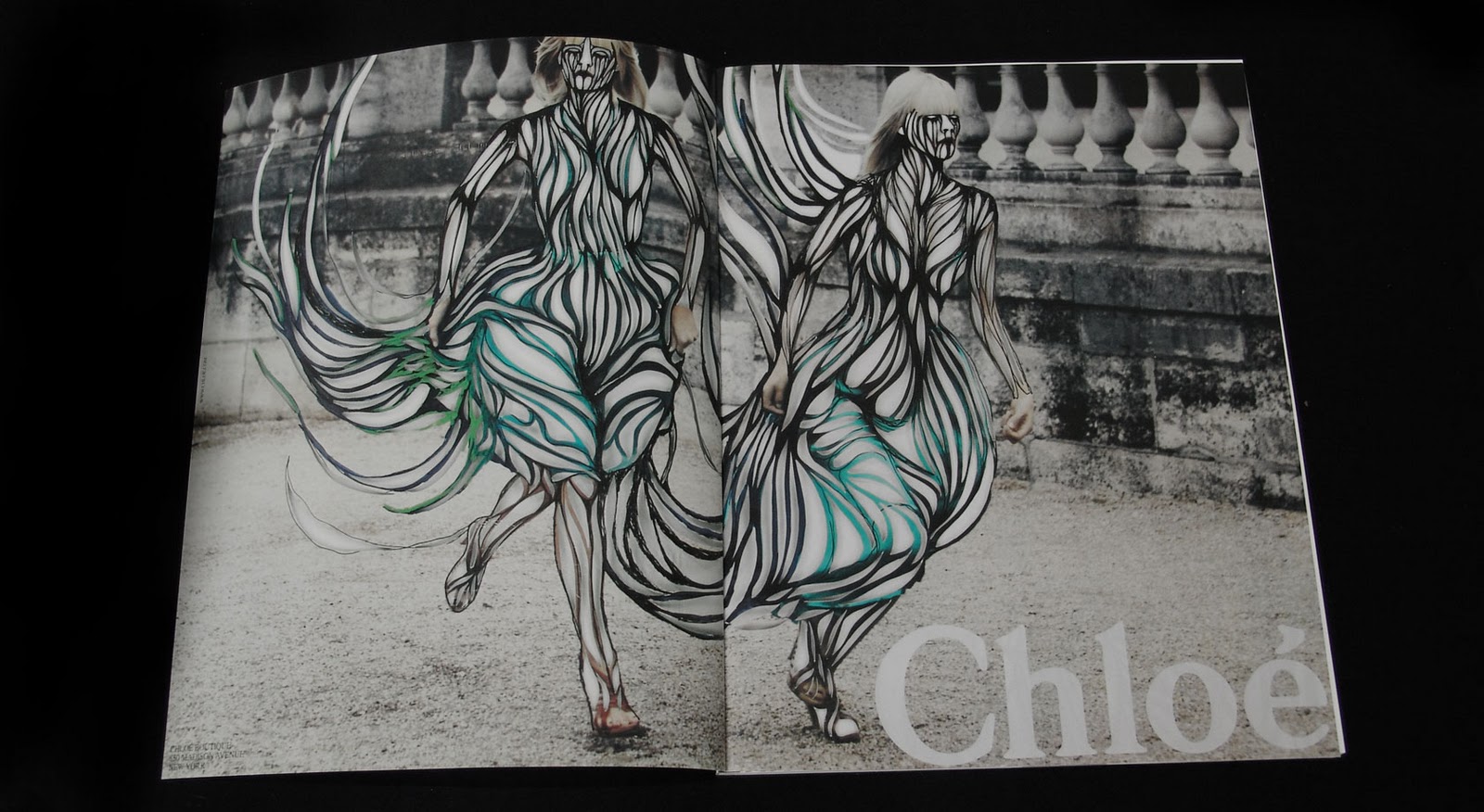 |
| Neue Mode magazine curated by Javier Peres artwork by Amie Dicke Fall/Winter 2006 |
Doing something like this would allow me to bring in the pointed limbs to express movement which could be scene in the animations on the previous post.
(ps: my theme hack hates images I'll have to fix this!)
- Leave your comment • Category: Project 1: Aquapax
- Share on Twitter, Facebook, Delicious, Digg, Reddit
I have had several days to think about this project so far and have been keeping a document with a series of links that have been inspiring my though process as I develop my idea.
To remind myself of this inspiration, inspire new idea and let you see what I'm working towards I'm going to do a quick write up of the stored links.
During the summer I saw the film Pina which is a combination of dance and documentary about the dancer and choreographer Pina Bausch. It features incredible location and dancing and is full of beautiful shots. There is one scene in the film where they are dancing in water the piece is very stripped back and there is just the dances a large rock and the water of set. This reminded me of the pure and neutral qualities of Aquapax and got me thinking that I would like to create a piece that involved dance and moment.
There is a really great quality about being able to see the power of the dances and the water. the splashing makes interesting forms and extends the dancers movements. The high quality footage I am very keen on as it expresses the idea of quality.
If I where to film something like this location would be very important as it creates a mise en scene which allows for the dance pieces to be read on more levels than the physical movements.
Due to the difficulties of filming a piece as high quality as Pina I began to think that I could create an animation similar to the Google doodle for Martha Graham
I really love the simple lines in this piece all the movement looks really fluid due to the stylised pointed limbs as they move and the liquid trails which they leave. This Piece also made me think of Thoughts of You
This is another dance animation but In this piece the white figure of the woman is made of smoke this makes the relation ship between the to figures really interesting and creates a great story. This concept of stylized animation could be used really well to express brand values by having one of the figures representing the consumer and the other representing the brand. This piece also makes use of pointed limbs in the movement. The colour pallet of both pieces are muted paper tones which seems to be a reflection of the stylized pencil drawing styles.
I really like this Idea of using dance in my piece but I felt like it was not let at the quality level that the client wanted. M&S have had TV campaigns where they raised the public opinion of there brand.
They filmed high quality in super slowmotion and set it against a sensual voice talking about how the food was so high quality and its link with M&S. Having the product be the central focus of the advert is something that reflects high end jewellery and desirable items. Another way this advert helps to a sense of luxury is the colour grade which the video has, it reminds me loads of classical still life paintings which are regarded as an interest of high society.
Looking at these videos my current idea is to create a promotional dance film such as this one by american apparel
It will take inspiration from M&S and use super slow motion combined with an interesting voice over to build an idea of luxury. By carefully selecting models, wardrobe and a location I can communication even more of the brand values without making the piece into a public service announcement.
- Leave your comment • Category: Project 1: Aquapax
- Share on Twitter, Facebook, Delicious, Digg, Reddit
We have been given our first project of the year. The brief is to create a piece of animation/moving image/motion graphics which enhances the brand Aquapax. The video will be accessed through a QR code on the packaging of the bottle.
This is a really exciting brief as it allows us to create a really high quality piece of design. Another exciting part of the brief is that there is the potential for someones design to be linked on the bottle through a QR code.
The creator of Aquapax Neil Tomlinson came in on wednesday to talk to us about the brief and his product. Here are some of the key points I picked up from this
- It is an Ecolux brand, a combination of environmental and luxury.
- The water is very high quality
- It is a friendly brand
- Has high profile clients
- Conscious of its carbon footprint
- The Client likes clean design
- it should not be try and greenwash people
- Brand dose not manipulate
- There is a strong personal story behind the brand
- Packaging has a strong design
- Its an existing luxury brand in France
- Leave your comment • Category: Project 1: Aquapax
- Share on Twitter, Facebook, Delicious, Digg, Reddit
I've just started a new course BA Digital Media Design Top up which lets me turn my FDA which I got last year into a full BA.
As part of this course I need to have a new blog, so here it is. Expect to find analysis on design, art and digital media as well as works in progress and final pieces of the projects I do this year.