I am still interested in the uses of data so decided to look more into data visualisation to see how those ideas could spread through into my work. While doing this I came across a visualisation of the wind in the USA by Hint.fm. I This this is a great idea and is really nicely executed.
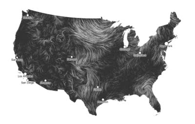
I can really imagine the map being displayed in a gallery space. It scrapes its information every 30mins but stays dynamic and engaging with this way in which it displays its data. They also show information about visualisation alongside it which I think works well when seen over a website but if this were in a gallery I would like to only see the map.
- Leave your comment • Category: Project 5: Independent Project
- Share on Twitter, Facebook, Delicious, Digg, Reddit