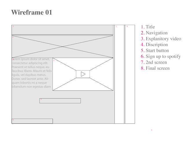
I have drawn up my initial wireframe for my Spotify site I still needs work as several of the areas seems really empty and some elements seem to have no logic to there placing as I will explain below.
This wireframe is for 1280x1024 the final design will vary based on screen size. The concept here is to have a screen where areas grown and shrink depending on what is clicked so that all the content is always available and you do not need to navigate deep into the site to get started. This would mean that when you click the begin button the panel numbered 7 would slide out and the home panel decrease, to take the the same amount of size as 7 dose in this image, ending up on the left.
My motivation for doing this that users want services to be immediately accessible and quick. The outcome you get from the service is not about watching and listening to a log piece its all about the short message that you choose to share. Another reason for wanting this system is that I think it works great for mobile devices which due to the nature of this site would often be the platform the users accessed the site from.
The navigation currently resembles the current standard navigation layout, however because of my sliding website I am unsure how relevant this style of navigation would. Clicking suggests moving to a different location so currently I think some form of tab which suggests changing content within a fixed location would be better placed.
Having a short video on the home page is a great way to communicate a large amount of information about the brand and the aims of the website without taking up a large amount of the users time. Mailchimp dose it well though it is not the focus of their home page.
I think the positioning of the text description is a little odd as in its current position it would have to work alongside the video. I have also realised that I have not included a sub heading which quickly communicates he aim of the site without any clicks being needed.
The bottom 3rd of the website is currently really empty with only the sign up and begin buttons. I am keep to stay above the fold though due to large verity in screen sizes this may not be possible on every display. Since my design is currently responsive and takes up all the horisontal space I feel I should do the same with the vertical by spreading out the content more. This would leave me with more empty space on the site which I consider a good thing as my plan is to have the background and "theme" of the site changeable so that it can be used for seasonal events, competitions etc. Grooveshark currently dose this really well.
- Leave your comment • Category: Project 4: D and AD
- Share on Twitter, Facebook, Delicious, Digg, Reddit
